
This is on the very first stage of a redesign of the current eBay website. This is mostly my thought process through figuring out aspects of strong elements I would want to keep and what I would want to remove and improve. I explored different options to wireframe with, but ultimately chose FIGMA since I am relatively familiar with FIGMA and it is free for students. FIGMA made it easy for me to use as a canvas to convey ideas I wanted to change about the website.
PROCESS
RESEARCH & USERS COMPLAINTS
New users have trouble navigating through eBay because it has so many features that are unknown to them. eBay’s platform has evolved over the years, and users who are new to the platform may find it challenging to learn and understand all its features quickly. The learning curve can contribute to the perception of complexity. In addition, a lot of returning users commit slips and are frustrated that they made the same mistake again even though it is the designer’s fault for making the website more complex than an ordinary shopping site. Users also complain about the difficulty in communicating with buyers/sellers. Additionally, eBay is very text heavy. It is infamous for having a large amount of information in a page, product, etc. eBay also has an older style of design which turns some users away from using the website because of attractiveness bias. All in all its main problems that make eBay complex for some users include feature richness, information overload, discoverability/learning curve, and search complexity.
GOALS
My main goals going into the wireframe redesign were interface simplicity, modern aesthetic, highlighting essential content and removing unnecessary information, and making the discoverability of eBay’s features easier to learn for new users, and improving functions of the website such as communication between buyer and seller.
EXECUTION
First, I want to discuss the homepage. Some weaknesses of the homepage are how there’s a lot of information on the top of the page. This issue correlates to the discoverability of eBay’s features. Additionally, it lacks in and overall it is using a lot of space for overly large visuals. Some strengths of the homepage that I kept for my wireframe redesign was the recognition vs. recall aspect of this homepage as well as its use of signifiers and feedback. eBay also follows a universal standard of mapping for websites which I am going to follow as well in my redesign.
Pros | Current eBay. The details I am going to keep are “Recently Viewed Items” so users can recognize instead of having to recall, the overall mapping such as: the search bar at the top, logo in the top left, shopping cart and profile in the top right, the signifiers like the bar at the bottom of text letting the user know they can click on that text, and the feedback such as the red circle with a 1 on the shopping cart, letting the user know they have added something to their shopping cart.
Cons | Current eBay. The aspects of the interface that I am going to change are to remove large amounts of text with unnecessary information and make the design simpler in order to improve the discoverability of the interface. Additionally, I want to include more visuals in the homepage so users are able to see more rather than read more. I want to add an algorithm to cater to the users’ likes and the type of things they would actually want to buy since eBay is a huge website with an enormous selection of products which would reduce problems with navigation. This algorithm would be based on what the users view and what they have bought before. In order to improve the user experience of the homepage, I want to make it easier to navigate through the website without it being confusing for users in order to avoid mistakes such as clicking on the wrong button that leads users to a new page. This starts with giving users less buttons and making the buttons clean and simple so that users don’t make mistakes while learning how to use the website and their array of features. Also, so that the users aren’t frustrated using eBay.

eBay | current homepage

My eBay Redesign Wireframe
At the top I added icons that are clear signifiers to be clickable. Additionally, I added a profile icon to include all the information that is at the top bar of the current website so it is out of the screen, but users still know they can access this information through this button because “Sign Up,” “Log In,” and “Information” is universal to be in the profile page. Additionally, I made the homescreen to be able to have more visual information that users can recognize instead of having to type what they want by an algorithm that includes the title, brand, and image of the product. I wanted to keep the banner, but wanted 3 to be visible at a time so the user would be more inclined to explore what the company eBay wants users to know. Lastly, I added a messaging bubble on the bottom right that is easily accessible to users to communicate with their buyers/sellers. It also has a red circle if there are any pending messages giving the user a signifier that there is something pending for them in the messaging page.
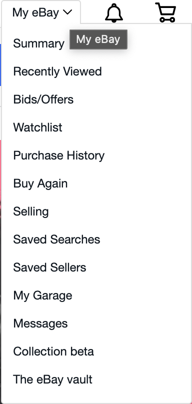

My Menu Redesign
eBay | Current Menu
On the menus, I removed options that seemed repetitive or unnecessary and boiled it down to what it is in the redesign. I also added icons because icons reduce cognitive load, enhance visual communication, and icons that are the Knowledge of the World. Adding a heart icon instead of “Watchlist” bridges the the Knowledge of the World with the Knowledge in the Head because the heart icon is known for being liked or saved items in a shopping website. The overall navigation improved by simplifying the list as well as improved user experience since the users ultimate goal is to shop, not to read or figure out a complex website. Another aspect that makes eBay more complex than a regular site is that the users that are buying products also sell products.While working on the menus, I considered the users conceptual model into the design. Because ebay allows users to sell their own items, I wanted to separate buying with selling for users that do both and for users that do one. With that, since buying is more popular than selling, I included the selling aspect in “My Account.” For users, this is a conceptual model that is easier to understand and helps differentiate the different tasks users want to achieve.

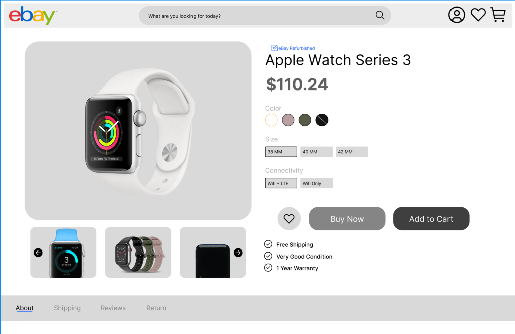
eBay | Current Product Page
My Product Page Redesign Wireframe
Product Page. Second, I am going to discuss the product page. The main issues for the product pages were information overload, unnecessary complexity, lack of simplicity, and an old design. What I changed was making the options for the product more visible so that users can see all the options at the same time, as well as, reducing the amount of clicks the user has to do. A lot of the information seemed unnecessary to have alongside the product, so for users that want to know more information can find more information at the bottom. Users will know that they can find more information at the bottom because it is a universal concept in shopping websites. In the redesign of the product page, I have included feedback for buttons so that users know whether they pressed it or not.
